That burnt red is incandescent, against that steely blue and grey it is vibrant and very, very cool.
I prefer the cooler side of the spectrum and so I started thinking about what sort of layout or project would suit this as a backdrop.
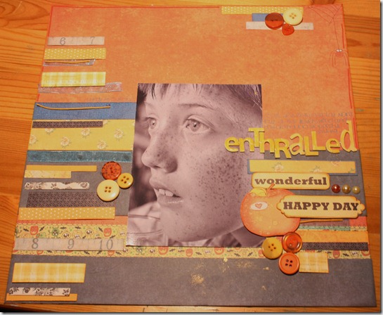
I decided on a layout and then decided on my photo of Louis, my eldest son, taken fairly recently; he was being told a tale from his Nanny

Enthralled. I loved the look on his face so I scooched back and snapped him.
I do believe that this will be a photo that I will treasure (and scrap) till the end of my days. I also very much need to add that this layout looked quite sparse until I saw Sian's layout here that I loved and inspired me to add the strips which has finished it off. Thanks Sian.
So usual colour combo blog hop info applies. I hope you got here from Bunnyfreak’s fab blog-she’s clever, well you know that if you have come from there.
If you made it all the way here then many thanks, I appreciate it.
Here is the full blog hop.
www.abstractsmixedwithextracts.com
http://suealthouse.blogspot.com
http://xnomads.typepad.com
http://michelleroycroft.blogspot.com
http://throughthecameralens.typepad.com/
http://snapsandsnippets.blogspot.com
http://scrapyourlife.net
http://spud-pickle.blogspot.com/
http://curlyscrapbooker.blogspot.com
http://1200somemiles.blogspot.com
http://sugarandscrap.blogspot.com
http://alyssephotographs.blogspot.com
http://istampscrapcraft.blogspot.com
http://handmadebykirsty.blogspot.com
http://adriennefalzon.blogspot.com/
http://helenascreativemaven.blogspot.com
http://digipage-blog.everything-digital-scrapbooking.com/
http://scribblesstickingstitchingstroking.blogspot.com/


This is such a wonderful photo! I can see why you will treasure it. The colour scheme works with it really well, especially those lovely yellowy tawny shades which suit the photo perfectly.
ReplyDeleteThose colours are so lovely :) They give such an impression of warmth! It's a great photo, and a great layout xx
ReplyDeleteThis is a fantastic page and I love that you have captured how caught up in the story he is - a wonderful page.
ReplyDeleteThat color scheme really compliments your son's complexion. And you are telling a lovely story. Nice work.
ReplyDeleteLove the use of strips of paper. Adorable layout.
ReplyDeleteA sweet memory captured. Love the sepia tone to your photo to coordinate with your lovely layout.
ReplyDeleteCheryl M
http://scrapyourlife.net
I just adore how you used so much patterned paper on one page! What an amazing photo. You can definitely see how interested he is.
ReplyDeleteGreat photo and layout! It is one to scrap again and again :)
ReplyDeleteWhat a lovely photo. I love how you've used so many little strips too
ReplyDeleteThanks for the comment on my blog.
ReplyDeleteThat's a really lovely colour combination, I would never have thought of putting the blue in there but it really makes the page pop. I also think you've found a clever way to use up all those annoying little scraps!
What a sweet photo and I love all your patterned paper strips! See you in the Pretty Paper class!
ReplyDeleteNot that's a "scrap page" - love all the strips you used. Nicely done.
ReplyDeleteWhat a great photo and I love the page you've done to show it off. One to treasure, Jen.
ReplyDeleteSue x
Wonderful shot! The patterned paper strips are too fun!!
ReplyDelete